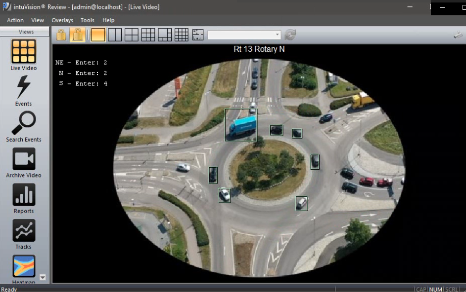
Overview of the drone view used for traffic circle counting in intuVision VA.
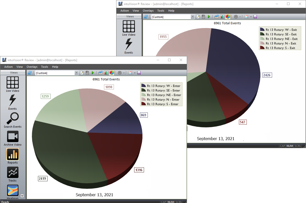
Pie charts comparing the ratio of vehicles entering and leaving each leg of the rotary.
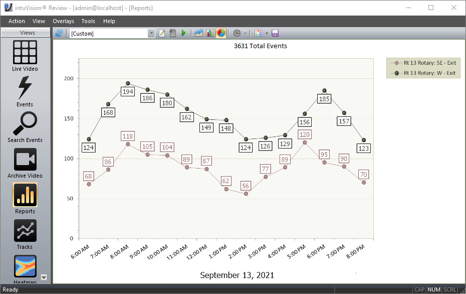
Line graph comparing entrances from the Southeast and Northeast directions.
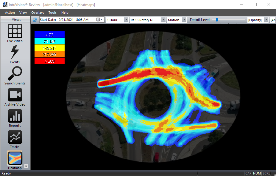
Heatmap showing an overview of traffic in the circle, confirming traffic is heaviest from Southeast to West directions.
Drones are commonly used in traffic analysis to collect footage from large intersections and traffic circles for post-processing of recorded video. In this blog we present intuVision Traffic in action counting vehicles from video of a traffic circle collected with a high drone tether.
The goal is to count vehicles entering and exiting the traffic circle from each direction understand the traffic patterns and bottlenecks. This information would be used in conjunction with data collected from other intersections to see flow rates through each entrance and exit, to identify areas where traffic is most likely to get clogged, and analyze busy ingress and egress directions over time to help optimize the city traffic.
The sample video below shows periods of counting vehicles entering from all 5 entrances and leaving from the 5 exits. In the video, the entry and exit counts are shown separately for ease of understanding, though in the deployed system intuVision Traffic counts all directions in one pass.
intuVision reporting is used to view and compare vehicles count data from each entrance and exit, creating easily shared graphical reports. Report types include line, bar, and pie charts - though primarily pie and line are used in this case as well as traffic heatmaps.
Pie charts are used to see a quick comparison of the ratio of vehicles entering and leaving each leg of the rotary. These charts show that while the Southeast direction has the most traffic entering the rotary, most people leave the rotary either towards the North or the West. As a result, vehicles entering the rotary from the Northeast direction were most likely to be slowed in entering, as many vehicles enter from the Southeast direction, making traffic flow past the Northeast entrance very heavy. A deeper investigation into the traffic patterns shows that people tend to return via another route due to congestion entering the rotary from the West.
The above understanding is solidified looking at the intuVision Heatmap over different periods of the day, here you can see that it confirms the general overview that the most commonly travelled path over the duration of this heatmap is from Southeast to West.
If you think that intuVision VA can help you or your customers, or are interested in testing our new release, you can reach us here.

© Copyright 2006-2026 intuVision, Inc. All Rights Reserved. intuVision is registered in the U.S. Patent and Trademark Office.